install.packages("topmodels",
  repos = c("https://zeileis.R-universe.dev", "https://cloud.R-project.org"))
if(packageVersion("gamlss.dist") < "6.1-3") {
  install.packages("gamlss.dist",
    repos = c("https://gamlss-dev.R-universe.dev", "https://cloud.R-project.org"))
}Forecasting and Assessment with topmodels

1 Probabilistic model infrastructure
The topmodels package provides a common interface for probabilistic predictions, calibration plots, and scoring rules across model classes. Here we compare an ordinary Gaussian regression with a distributional regression for traffic counts on the log scale. This continues the prediction workflow in First Steps.
Install the additional package from R-universe before running this vignette.
2 Data and models
The HarzTraffic data contain daily traffic counts and weather measurements. We use cars, the number of cars, and yday, the zero-based day of the year. The first model uses a cubic polynomial for the mean log count and constant residual variance. The second uses cyclic smooths for the location and scale of a skew-normal distribution (SN2), with constant shape. This comparison changes both predictors and family, so it does not isolate either change.
library("gamlss2")
library("topmodels")
data("HarzTraffic", package = "gamlss2")
m1 <- lm(log(cars) ~ poly(yday, 3), data = HarzTraffic)
m2 <- gamlss2(log(cars) ~ s(yday, bs = "cc") | s(yday, bs = "cc"),
  data = HarzTraffic, family = SN2, trace = FALSE)
3 Probabilistic forecasting
procast() evaluates fitted distributions through the same interface for both models. The outer quantiles below enclose 95% of each fitted distribution and the middle curve is its median. These bands describe response variation; they are not confidence intervals for the fitted median.
nd <- data.frame(yday = 0:364)
q1 <- procast(m1, newdata = nd, type = "quantile", at = c(0.025, 0.5, 0.975))
q2 <- procast(m2, newdata = nd, type = "quantile", at = c(0.025, 0.5, 0.975))
day <- nd$yday + 1
plot(log(cars) ~ I(yday + 1), data = HarzTraffic, type = "n",
  xlab = "Day of year", ylab = "Log car count",
  ylim = range(log(HarzTraffic$cars), q1, q2))
polygon(c(day, rev(day)), c(q1[, 1], rev(q1[, 3])),
  col = adjustcolor(2, alpha.f = 0.4), border = "transparent")
polygon(c(day, rev(day)), c(q2[, 1], rev(q2[, 3])),
  col = adjustcolor(4, alpha.f = 0.4), border = "transparent")
points(log(cars) ~ I(yday + 1), data = HarzTraffic,
  col = adjustcolor(1, 0.3))
lines(day, q1[, 2], col = 2, lwd = 2)
lines(day, q2[, 2], col = 4, lwd = 2)
legend("topleft", c("Gaussian regression", "Skew-normal GAMLSS"),
  col = c(2, 4), lwd = 2, bty = "n")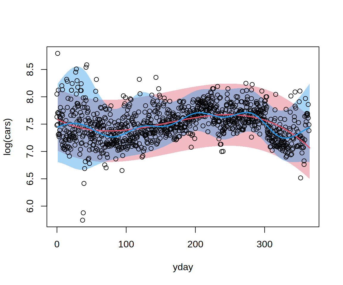
Exponentiating these quantiles gives quantiles on the car-count scale because the transformation is increasing. Exponentiating a fitted mean log count would not, in general, give the mean count.
4 Graphical model assessment
4.1 Diagnostics for each model
The four plots examine different aspects of fit:
- The rootogram compares observed and expected frequencies on a square-root scale.
- The probability integral transform (PIT) histogram should be approximately uniform under a well-calibrated continuous distribution.
- The quantile-residual Q-Q plot compares transformed residuals with normal quantiles.
- The worm plot detrends this comparison, making systematic departures easier to see.
We first inspect the Gaussian regression, then the distributional model. These are in-sample diagnostics; satisfactory plots do not establish predictive performance on new data or calibration within every covariate subgroup.
par(mfrow = c(2, 2))
rootogram(m1)
pithist(m1)
qqrplot(m1)
wormplot(m1)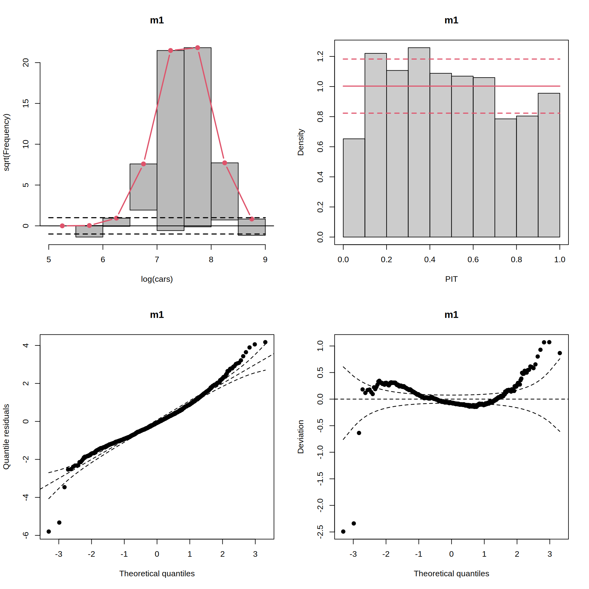
par(mfrow = c(2, 2))
rootogram(m2)
pithist(m2)
qqrplot(m2)
wormplot(m2)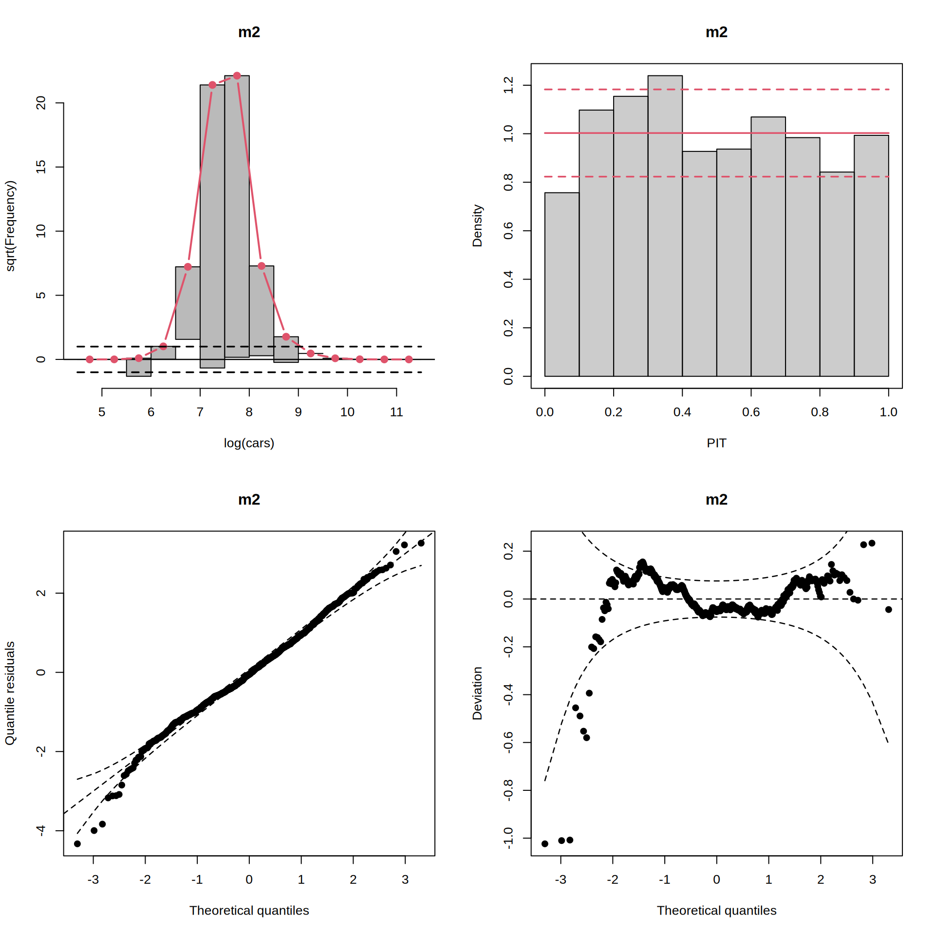
4.2 Comparing diagnostics
Overlaying the same diagnostic for both models makes their differences easier to identify. Keep the colors from the prediction plot: red for the Gaussian regression and blue for the skew-normal model.
par(mfrow = c(1, 2))
p1 <- pithist(m1, plot = FALSE)
p2 <- pithist(m2, plot = FALSE)
plot(c(p1, p2), col = c(2, 4), single_graph = TRUE, style = "line")
w1 <- wormplot(m1, plot = FALSE)
w2 <- wormplot(m2, plot = FALSE)
plot(c(w1, w2), col = c(2, 4), single_graph = TRUE)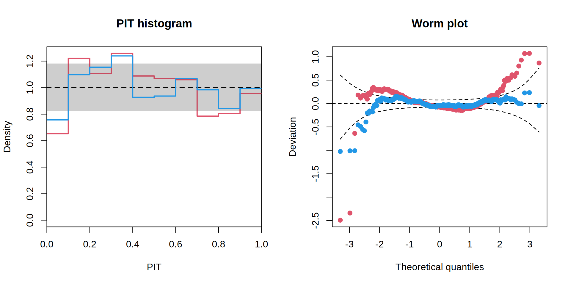
5 Scoring rules
Scoring rules reduce predictive performance to numerical summaries. The log score and continuous ranked probability score (CRPS) assess the predictive distribution, whereas mean absolute error (MAE) and mean squared error (MSE) assess point predictions. The Dawid–Sebastiani score (DSS) uses the predicted mean and variance. In topmodels these are losses: smaller values are better. Compare models within a score, since the scores have different scales; see the proscore() reference.
m <- list(lm = m1, gamlss2 = m2)
sapply(m, proscore, type = c("logs", "crps", "mae", "mse", "dss"))
lm gamlss2
logs 0.1806799 0.03795853
crps 0.1580683 0.1471419
mae 0.2191784 0.2081132
mse 0.08403538 0.07786656
dss -1.476517 -1.739153 Both models are scored on the same observations and the same log-response scale. These training scores describe fit and can favor flexible models. For a predictive comparison, refit on training data and score held-out responses, using a time-ordered split when the aim is forecasting later days. Prediction and Uncertainty shows a simple held-out interval check and explains how response variation differs from uncertainty in estimated distribution parameters.